🎓 Grad Services App
The Grad Services app was built to streamline the approval process for graduation services used by school administrators. By creating a single source of data, it reduced the friction of approving thousands of graduate students’ information while improving privacy and reducing paper usage.
Web Design
•
Prototyping
•
Component Design
•
User Flows
•
Web Design • Prototyping • Component Design • User Flows •
Design Challenge
Before this project, schools reviewed thousands of student records on printed sheets — a slow, error prone process that made updates and approvals inefficient.
The first online version lacked clarity and ease of use, leading many to abandon it for the original paper method.
The challenge: How can we simplify the process and design an experience that’s as effortless as paper?
User Researcher, User Interface Designer
Role
March 2023 - May 2023
Term
The Process
🙇♀️ 1. Empathize
I spoke with school administrators and studio staff, the app’s two key user types, and gathered feedback through emails and Slack threads. By documenting and organizing their input, I identified shared pain points and opportunities to improve the experience for both sides.
🔎 2. Define
After identifying user pain points, I analyzed the app and found issues such as a complex user flows, missing action confirmations, inconsistent hierarchy, and lack on emphasis on important sections. This process also helped define key user flows and edge cases to consider in the redesign.
💡3. Ideate
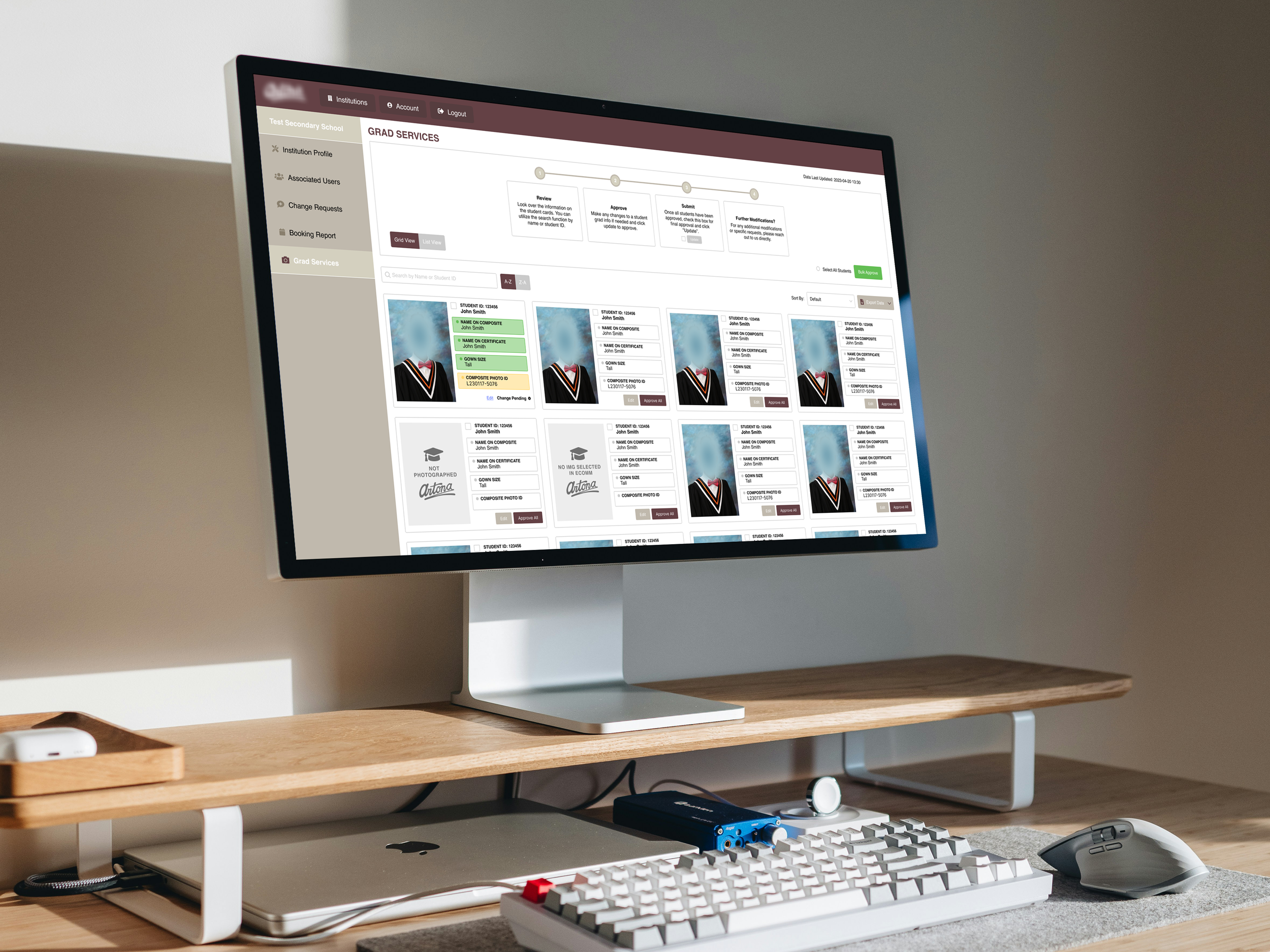
I worked alongside our developer to explore what was possible for the redesign. I proposed a one-click solution that lets users apply changes to multiple items at once, with a slide-out panel for any edits, so everything stays simple and efficient.
🎨 4. User Flows
Using Figma, I mapped comprehensive user flows covering different journeys, interactions, and edge cases. From here I was also able to define the supporting components to visualize states and interaction behaviours.
👍 5. Handoff
After walking through the app with our developer to confirm technical feasibility, I brought the design to our sales team and account managers for feedback. This step ensured everyone had a clear understanding of how the app would function and allowed me to gather anymore insights from those directly communicating with clients. Their input helped highlight missing details and usability gaps that weren’t initially obvious. Once the revisions were refined and aligned with both user and business needs, I finalized the design and prepared it for development.
Additional Deliverables
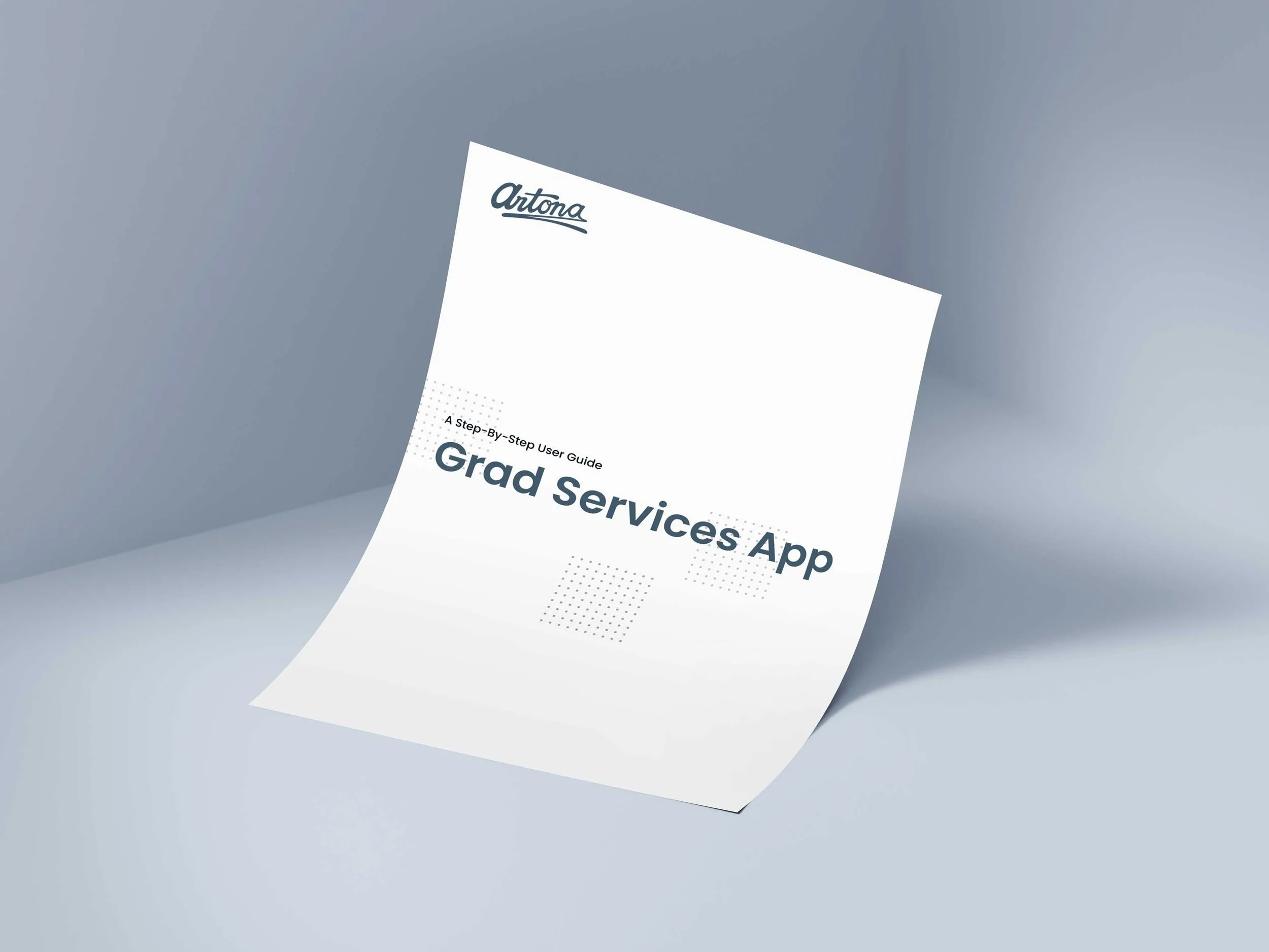
User Guide Document
After development, I created a comprehensive user guide specifically for school administrators. The guide walked users through every step of the app—from logging in to approving student information—and addressed common questions and troubleshooting scenarios. It’s goal was to make onboarding effortless and ensure that even non-technical users could navigate the platform with confidence.
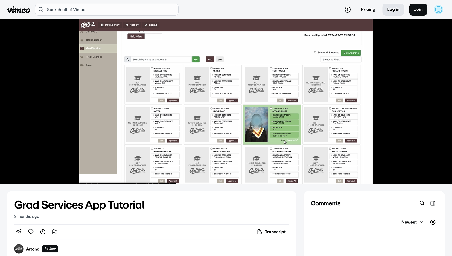
Video Tutorial
In addition, I created a step-by-step video tutorial that walked school administrators through each user flow. The video provided a clear visual reference to help them navigate the app with ease and efficiency—reducing the learning curve and minimizing the need for additional support.
As a result, the app benefited both school administrators and multiple teams within the studio. It has provided full visibility on deadlines, tracks grad services progress, and enables quick updates. The digital team experienced a smoother workflow with fewer errors, while the sales team could share information more efficiently.
Outcomes
Building this app taught me the value of detailed user flows for design handoff, which helped me communicate clearly with developers and stakeholders and reduced the need for revisions. I also saw how effective onboarding and guides can make users feel confident from the start, and how collaborating with all types of users ensures the design stays transparent and truly user-focused.